UI/ UX CASE STUDY • SELF-INITIATED MVP
Rebound
Recovery
Recovery Doesn't Happen Alone. Neither should the Experience.
Following major knee ligament surgery, I experienced firsthand the isolating, unguided reality of physical rehabilitation. To solve this, I designed Rebound—a secure digital health platform that bridges the communication gap between recovering patients, everyday caretakers, and clinical physiotherapists. This case study details how I structured a collaborative, multi-portal experience in Figma, optimizing every screen for low cognitive load and high compliance during physical pain.
Role :
UI/ UX Designer
The Ecosystem: Patient App, Caretaker Portal, & Clinical Physiotherapist Dashboard
Design Tool: Figma (Architected with Local Components & Styles)
Project Anchor: Self-Initiated MVP (Derived from Lived Recovery Hypotheses)
Section 2 : The Spark & MVP Scope
Personal Friction as a Product Hypothesis:
How Lived Post-Op Pain Pruned Our Feature Matrix
Following major knee ligament surgery, I experienced firsthand the isolating, unguided reality of physical rehabilitation. I quickly learned that when you are in acute physical pain, the idealized, friction-free "happy path" simply does not exist . Navigating recovery with low mobility and heavy mental fatigue taught me that daily therapy compliance is a battle against physical exhaustion. Rather than hiding behind generic, templated user surveys, I treated my own post-op struggle as the ultimate extreme user benchmark . This direct product empathy allowed me to prune our feature matrix with brutal, real-world realism—ruthlessly separating high-impact daily survival features from complex, low-value ideas that would only overwhelm a recovering patient.
Mapping the Visceral Friction: Translating Lived Post-Op Pain into Product Hypotheses
To bypass the superficial templates of generic user personas, I mapped out my own daily post-surgical physical therapy loop as a sequential storyboard . Documenting the real-world physical and mental friction points—navigating crutches, managing painful daily exercises, and battling heavy cognitive fatigue—directly shaped our early feature priorities . This exercise in extreme user empathy ensured we didn't just design screens, but engineered a supportive digital safety net that respects the painful, non-linear reality of surgical rehabilitation .

Returns Home
The patient returns home after surgery and begins the recovery journey

Needs Guidance
He feels uncertain about the right exercise, medication, and what to expect next

Daily Recovery Plan
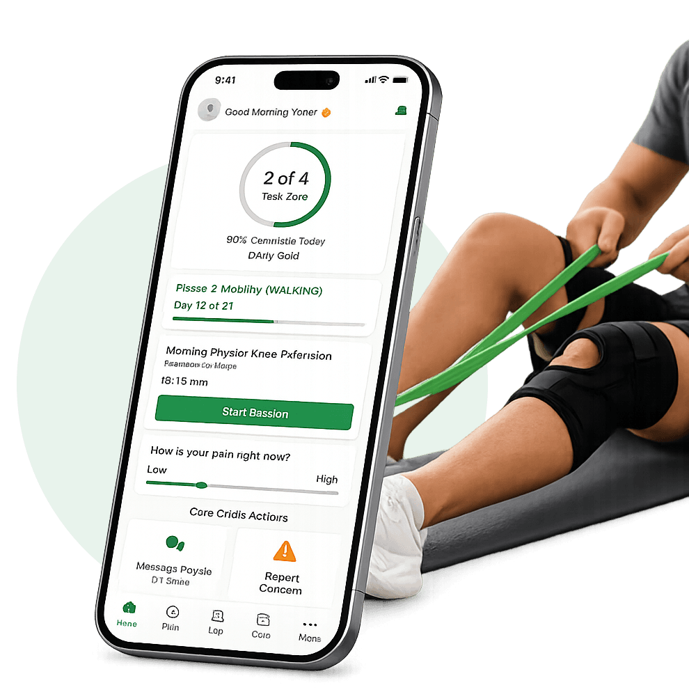
Rebound provides a personalized daily plan with tasks, reminders, and goals

Guided Physiotherapy
He follows guided exercises and updates the exercise he had done in the app
Caretaker Support
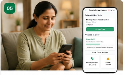
Caretakers stay informed by real-time updates and reminders to support the patient.

Physiotherapist Review
Physiotherapist monitors progress remotely and adjust the treatment plan as needed.
THE STRATEGIC MVP BOUNDARY: IMPACT VS. EXECUTION EFFORT

Direct Empathy Over Mock Surveys
Recruiting healthy, surrogate users for testing often yields speculative feedback that ignores the visceral reality of post-operative trauma. By using my direct, firsthand experience with ligament rehabilitation as our primary project hypothesis, I bypassed the standard, superficial persona templates . I designed specifically for a user experiencing low physical mobility, heavy medication schedules, and severe cognitive fatigue. This real-world baseline kept our MVP focused entirely on genuine clinical utility rather than theoretical, generic healthcare features.
Trashing "Thankless Tasks"
When navigating acute surgical recovery, patients do not care about unlocking social badges, competing on leaderboards, or loading heavy 3D animations. I recognized these features as classic 'thankless tasks'—highly demanding to design yet functionally useless for early physical therapy compliance. By ruthlessly deprioritizing them, I kept our MVP focused entirely on simplifying the clinical communication loop and reducing patient interface anxiety during high-pain recovery cycles
Designing for Physical Pain
A patient's physical and mental tolerance for data entry drops significantly during painful daily exercises. Recognizing this constraint, I categorized low-friction interactions—like a single-swipe pain scale, a binary symptom logger, and automated notification syncs—as immediate 'Quick Wins'. Minimizing the interaction cost of logging critical clinical data ensures high daily compliance, allowing recovering users to complete their daily therapy logs in under 5 seconds without inducing additional physical discomfort or fatigue.
Decision Story 1 : Evolving the 3-Portal Ecosystem
Designing the Collaborative 3-Portal Ecosystem
How we tailored interactive touchpoints for patients, caretakers, and clinicians
Rebound is not just a standalone patient tracker; it is a highly collaborative, 3-portal orthopaedic recovery ecosystem. To protect daily therapy compliance and build clinical trust, I had to design for three distinct user roles simultaneously—each operating under completely different physical and emotional constraints. Through rapid iterative design in Figma, I mapped out and evolved three specialised interfaces [Sourav Haldar Portfolio 2025]: a low-cognitive mobile hub for patients managing acute pain, a comforting ambient status feed for anxious caretakers , and a dense, data-driven dashboard for clinical physiotherapists. Evolving these touchpoints in parallel ensures that critical recovery data flows seamlessly, transforming isolated tracking into an active clinical safety net.
PATIENT
Recovery at your fingertips.
Low Fidelity
High Fidelity


PHYSIOTHERAPIST
Manage care, drive outcomes
Low Fidelity
High Fidelity


CARETAKER
Stay informed , provide support
Low Fidelity
High Fidelity


INTERACTION ARCHITECTURE UNDER SCRUTINY
Patient: Low-Interaction Gestures
Minimizing interaction cost for users under physical trauma and painkillers.
For the recovering patient, cognitive and physical energy is at an all-time low during therapy. Early low-fidelity wireframes relied on standard text boxes and deep drop-down menus to log daily pain levels. However, I realized this structure was incredibly frustrating to use with low mobility. I ruthlessly stripped away the manual text fields and designed a large, interactive gestural swipe-slider instead. Condensing the entire daily log into a single swipe brought tracking times down to under 5 seconds, maintaining high medical tracking compliance
Caretaker: Calming Ambient Monitoring
Replacing constant worrying check-ins with supportive status cues.
Caretakers are often plagued by constant anxiety over their loved one’s recovery progress. Early sketches showed text-heavy logs that felt overwhelming and required active reading. To solve this, I redesigned the Caretaker dashboard around ambient, color-coded recovery status rings and automated push alerts. This allows caretakers to confirm their loved one is safely on track at a single glance, completely eliminating the friction of intrusive phone calls and offering immediate peace of mind.
Therapist: High-Density Diagnostic UI
Optimizing multi-patient data grids for rapid clinical triage.
Unlike patients or caretakers, physiotherapists need high-density clinical data to make fast, accurate treatment adjustments. In the clinical portal, I replaced spacious mobile layouts with structured, color-coded tabular grids. By highlighting patients with active pain spikes or low exercise compliance in warning red, therapists can review an entire multi-patient caseload in seconds, enabling prompt and precise remote rehabilitation triage.
Engineering a Calming, High-Accessibility Design System
Translating WCAG accessibility standards into supportive, real-world clinical safety.
An orthopedic recovery app cannot afford typical consumer aesthetics, as users must navigate the interface while managing post-surgical pain and rehabilitation fatigue. I engineered Rebound's design system to directly minimize this cognitive load and accommodate real-world recovery constraints. By combining a calming, clinical emerald-green palette with highly legible typography and clearly structured components, the interface remains completely intuitive for patients, caretakers, and physiotherapists alike. This system ensures that critical recovery and pain-tracking data can be recorded and monitored without adding friction to an already challenging physical journey.
Designed for Dexterity
Every color token, typographic weight, and spacing unit is optimized to minimize cognitive friction. By sizing interactive targets specifically for shaky, post-operative hands, we actively reduce patient tracking anxiety while keeping casework structured and scannable for medical therapists.
Design evolution across the three primary user roles of Rebound.


The Final Experience: Navigating the Connected Care Loop
A complete recovery experience designed for patients, caretakers, and physiotherapists.
Rebound is engineered as a circular care loop where no user role operates in isolation. Instead of treating interfaces as static screens, I designed Rebound's three portals to act as a living, asynchronous feedback network. When a patient completes an exercise or logs a pain flare-up at home, that data is instantly contextualised. It dynamically populates their caretaker's feed with reassuring status cues and triggers warning indicators on their physiotherapist's high-density clinical dashboard if a safety threshold is breached. This guided tour walks through a single day in a patient's rehabilitation journey, demonstrating how thoughtful UX actively bridges the gap between home recovery and professional clinical oversight.
High-Compliance Patient PT Sessions
Turning grueling, repetitive post-op exercises into clear, bite-sized tasks with real-time visual pacing, hold-timers, and immediate gestural logging to keep daily recovery momentum high.
Ambient Caretaker Reassurance
Eliminating intrusive, anxious check-in phone calls by presenting caretakers with a simple, high-level status feed and critical task lists to confirm their loved one is recovering safely.
High-Density Clinical Triage
Condensing vast patient metrics into a structured, color-coded clinical overview. This lets physiotherapists track active pain thresholds, review trend graphs, and modify treatment protocols remotely in seconds.
Frictionless Secure Onboarding
Balancing clinical safety with rapid digital accessibility by creating a streamlined, secure onboarding flow that makes it effortless for patients to connect with their specific care team.
PATIENT EXPERIENCE


DOCTOR'S EXPERIENCE


CARETAKER'S EXPERIENCE


LOGIN/SIGNUP EXPERIENCE


Outcome & Reflections: The Reality of Designing for Recovery
How a non-linear medical journey dismantled standard design templates
Designing Rebound reinforced the importance of balancing empathy with usability. Creating a platform for patients, caretakers, and physiotherapists required thoughtful information architecture, clear communication, and consistent interaction patterns to support recovery at every stage.

"Great design doesn't just solve problems—it empowers people to recover with confidence."
PROJECT HIGHLIGHTS
Connected Care
Linking patient exercises, family updates, and therapist triage into a seamless, asynchronous communication loop.
Recovery-First Experience
Ruthlessly stripping visual noise to help users record daily tracking logs in under 5 seconds during acute post-op pain
Scalable Design System
Translating rigid digital accessibility standards (WCAG) into comforting, oversized components built for uncoordinated hands.
Accessibility
Engineering active pain-threshold triggers that automatically alert clinical dashboards when anomalies are flagged
KEY LEARNINGS
The Fallacy of the "Perfect" Design Process
Real medical environments don't fit into clean Double Diamond templates. When users are managing acute surgical pain, standard usability testing fails; you must adapt to raw hospital-room realities.
Navigating Multi-Portal UX Tension
Designing a three-portal ecosystem taught me that what benefits one role can burden another. Clinical physiotherapists demand dense, tabular data grids; yet forcing that same complexity onto a fatigued patient would destroy daily tracking compliance.
Clinical Trust Beats Cheap Gamification
Standard consumer habit loops (like strict daily streaks or competitive leaderboards) induce unnecessary guilt and anxiety during a non-linear recovery where setbacks are common. Ambient, encouraging milestones build far greater clinical trust.
Systems Thinking Over Screen Creation
I stopped thinking of myself as an interface designer and began operating as a systems architect. Great UX in healthcare is about engineering secure, real-time data flows that seamlessly bridge the gap between home recovery and clinical triage .
FURURE IMPROVEMENTS
Computer-Vision Form Guidance
Leveraging on-device camera tracking to give patients real-time, hands-free feedback on their physical therapy posture and extension angles, reducing the risk of secondary injuries.
Passive Wearable Sensor Sync
Integrating with smart knee braces and consumer wearables to automatically sync swelling indexes, range-of-motion metrics, and daily step counts—completely eliminating manual logging.
Automated Triage Thresholds
Developing rule-based clinical alert filters that analyze weekly pain and mobility curves, immediately prioritizing patients with abnormal recovery trajectories on the clinician’s feed.
Offline-First Synchronization
Building a robust local-first database architecture so patients residing in rural areas with poor internet connection can log their movements uninterrupted, syncing safely once reconnected.